

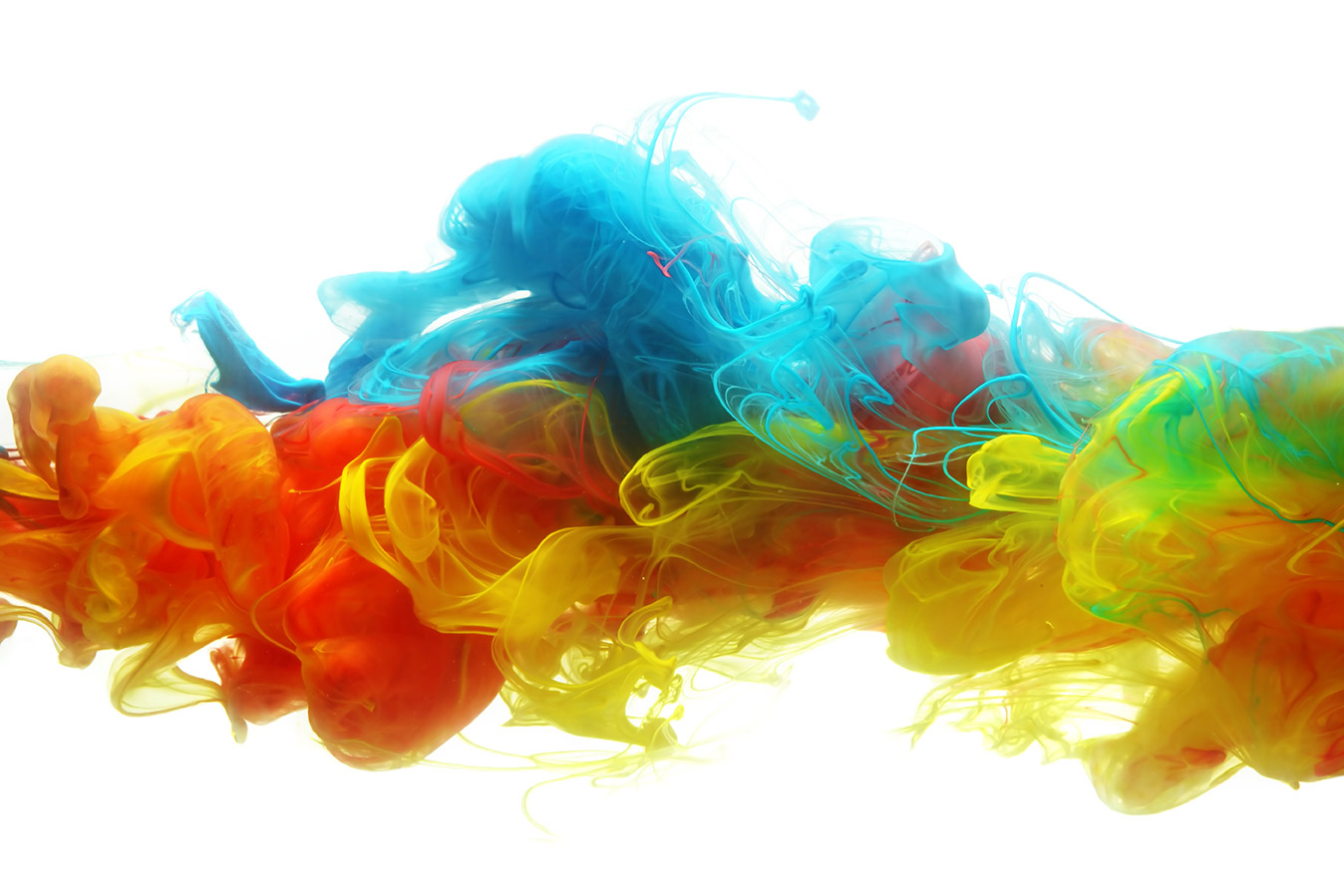
As the saying goes, “beauty is in the eye of the beholder.” Beauty aside, our associations with an item’s visual appearance can be manipulated. In fact, online visual merchandisers are experts at utilizing the psychology of color to influence many aspects of online buying. Here are a few of their sophisticated tactics:
Warmth
It may seem obvious once the concept is explained, but colors that skew towards yellow and orange inspire a “warm” feeling that imbues one with confidence in the product. In fact, psychologists often describe yellow as the “happiest” color and visual merchandisers online make as much use of it as possible. Think of such companies as Ferrari, DHL and Shell Oil.
Rockin’ Red
If energy is what you want to impart, red should be your color of choice. The quick, pick-me-up drink vendor Red Bull didn't pick it by accident. Still, the color should be used judiciously so as not to overwhelm the visitor to a website. Use red in your logo, but keep it to a minimum when imparting information. Other examples of brands that employ a digestible balance red include Coca-Cola, Virgin and Nintendo.
Enduring Blue
Regardless of which association is to blame -- the sea, the sky, or possibly myriad others -- the color blue is perceived as a “strong” color. Companies like Hewlett Packard, Lowes and IBM look to it to lend an air of authority to their sites. Unlike red, it can be used almost exclusively – with black lettering – to create a coherent and integrated look. Need more convincing? Take a look at your Facebook page.
Prudent Purple
We don't pretend to be able to explain this trait, but purple – lavender, more specifically – is associated with wisdom and imagination. Kwai Chang Caine would have been proud. Companies that embrace this color include Yahoo, the SyFy Channel and Cadbury. Still, this is a difficult color to coordinate with offline marketing efforts and should only be tackled with an integrated marketing strategy.
Clean Green
Inextricably associated with the environmental movement, the color green engenders feelings of health and wellness. Green also has the added benefit of being recognized as the color of “peace.” While John Deere and BP have adopted the color, more recent arrivals include Monster, Animal Planet and Whole Foods.
Rational Gray
Grays are balanced, calm and evoke a singularly stable environment. They are often used on websites that wish to project rationality. The color gray has been co-opted by traditional companies such as The New York Times and Honda, as well as by trend setters such as the Cartoon Network and Apple.
Studies show that colors are broadly associated with certain traits. The job of the visual merchandiser is not as simple as picking a color for a logo or a website background color. Instead, a visual merchandiser must identify which states of mind they wish to evoke, and compliment the website with colors that project a compelling user experience, and a unique brand personality.
Improving profit margins is at the top of all eCommerce merchandiser’s to-do lists which is why we’ve created The Digital Merchandiser’s Guide to Maximizing Margins with Visualized Data eBook.
Download the eBook to learn more!
